What the One-Sheet Promised: Four Weeks of Poster-Only Movie Nights
Photo: Sumanah, CC BY-SA 4.0, via Wikimedia Commons
The first rule of poster-only movie night is that you do not talk about the synopsis. The second rule is that you do not open a second tab. For four weeks in October 2026, I picked every movie I watched at home using nothing but the artwork. No plot summary. No Rotten Tomatoes. No trailer. If the poster did not convince me, the movie did not get a slot.
I kept a notebook. Left page: a quick sketch of what the poster promised — genre, mood, the kind of night I thought I was signing up for. Right page: what the movie actually delivered. Twelve movies later, I have thoughts about what artwork can and cannot tell you, and about the strange fact that a thumbnail on a streaming service is not the same thing as a poster.
The Rule and the Notebook
The setup was not scientific. I used whatever artwork appeared on the screen in front of me: the Criterion Channel's cover image, a Tubi tile, the little rectangle Roku puts next to a title. If I owned a physical copy, I used the case. I did not read the back. I did not hover over the description. I let my eyes vote.
The notebook had three columns: promise, delivery, and a one-word verdict. The verdicts were things like yes, no, and huh. The huhs were the most interesting.
What a Poster Actually Sells
A good poster is a compressed contract. It tells you the genre, the tone, and roughly how much effort you will need to bring. A face in harsh light says thriller. A group of people arranged in a triangle says ensemble comedy, probably with a wedding. A single figure walking away from something says drama, maybe with a secret. None of that is plot. All of it is a promise about the kind of evening you are about to have.
What surprised me is how often the poster was right about tone and wrong about everything else. One image — a woman in a red coat against a gray city — promised a moody character study. The movie delivered a moody character study with a car chase in the third act. The poster did not lie, exactly. It just left out the part where the character study got bored.
The Ones That Lied
The worst offender was a poster that looked like a quiet family drama: warm light, a kitchen table, a dog. The movie was a home-invasion thriller. To be fair, the dog was in the movie. To be fair to me, the dog did not signal that someone was going to come through that kitchen window with a crowbar. I wrote liar in the notebook. Then I crossed it out and wrote maybe I did not look closely enough. The poster had a shadow in the corner. I had ignored it.
That became a pattern. The posters that lied usually did it by omission, not fabrication. They showed me the room but not the door. They showed me the face but not the knife.
The Ones That Told the Truth
The best nights came from posters that were almost boring in their honesty. One was a plain white background with a single object — a suitcase — and a date. The movie was exactly that: a suitcase, a trip, and a date that went wrong. No surprises. I still think about it. The poster had done its job so well that I could relax into the movie instead of waiting for the other shoe to drop.
There is something to be said for a poster that spoils the vibe. In 2026 we are trained to want the twist, the hidden angle, the thing the marketing is not telling us. But a poster that tells the truth is a gift. It lets you choose the night you actually want.
A Thumbnail Is Not a Poster
Here is where the experiment got messy. Half of my movie nights were chosen from streaming tiles, and a streaming tile is not a poster. It is a crop. It is a face enlarged until the background disappears, with a title in a font that was probably tested on a phone. The artwork that a designer labored over gets squeezed into a rectangle the size of a business card, and sometimes the service swaps in a different image entirely based on what you watched last.
I noticed this most on Tubi, where the same movie can have three different thumbnails depending on the row. One made a comedy look like a horror film. Another made a horror film look like a comedy. I picked the horror-looking one and got a comedy. I wrote huh in the notebook.
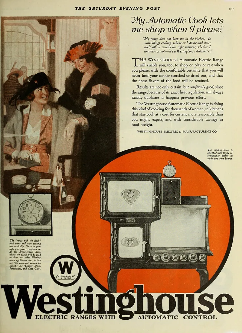
This is the part of the experiment that felt like 2026. The poster used to be a fixed object — in a lobby, on a DVD case, in a newspaper ad. Now it is a variable. The artwork is still doing the promising, but the promise changes depending on where you see it.
What I Am Keeping
I am not going to pretend that choosing movies by artwork alone made me a better person. I watched a few things I would never have picked otherwise, and some of them were bad in ways that felt like a tax. But I also watched fewer trailers. I spent less time scrolling. I committed to a movie based on a single image and then I actually watched it, which is more than I can say for most of my streaming decisions this year.
The notebook is still on the counter. I am thinking of keeping the rule for one night a week — a poster-only Saturday. Not because artwork is a better review than a review, but because it is a different kind of information. It tells you what the movie wants to be. Sometimes that is enough. Sometimes it is a lie. Either way, it is a place to start.